Your customers are online. Is your logo there to greet them?
Logo Design in Montgomery, Alabama
Graphic Design Services
Our Graphic Design Services provide affordable Logo Design Services for Montgomery-area business organizations.
Bizeeo Marketing Agency is a Logo & Graphic Designer located in Montgomery, Alabama.
Logo Design Services
Our Montgomery Graphic Designers can:
- Build a logo from scratch
- Customize an existing, stock logo
- Create an updated version of your existing logo
Whichever option you choose, we make your logo unique, stylish AND functional at a VERY reasonable price. Your Logo Design will also be adaptable and recognizable at any size and on any media.
There are several issues to consider when designing a logo, and they go way beyond aesthetics and branding.
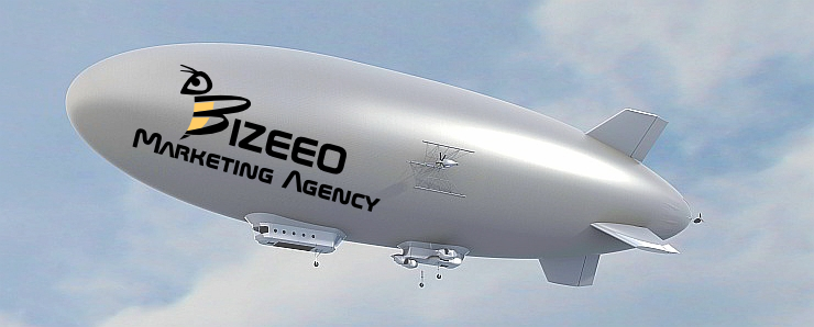
In short, your logo must be adaptable and recognizable in every instance it is used, whether it be on the side of the Goodyear blimp, outdoor billboard, business card, or website favicon. (see example images below)
“A designer knows he has achieved perfection not when there is nothing left to add, but when there is nothing left to take away.” ~ Antoine de Saint-Exupéry
Logo Design Services are included free of charge when you participate a monthly, flat-fee Marketing Plan offered by Bizeeo™.
We also provide free print Business Cards customized with your logo design.
So, do you know where YOUR logo is?
Bizeeo™ Logomark


Shown above is the logomark for Bizeeo Marketing Agency, located in Montgomery, Alabama.
The file image format is “PNG” (Portable Network Graphics) and displayed above at three different dimensions.
The PNG file format is a type of Raster graphics file format.1
The PNG file format is ideal for logos, logomarks and favicons (look at the tab in your browser window).
PNG file formats:
- Provide a transparency option enabling the overlay of your logo with backgrounds of varying colors and brightness
- Are relatively small in “size” (by “size”, we mean “document size”, NOT “image dimensions”2)
- Don’t degrade very much when re-sized, especially compared with other graphic file formats (the logo images shown above are actually one image scaled to three different dimensions.
Click here to view our logomark at its original, full-size version (300px by 300px), opens in new tab/window.
Bizeeo™ Logo
⇑
Looks best on lighter backgrounds.
⇑
Looks best on darker backgrounds.
This is the logo for Bizeeo Marketing Agency, consisting of the logomark (see above) and logotype (see explanation below).
Shown above are two variations, one is for lighter backgrounds and the other for darker backgrounds. The image format is png and each variation is sized at 300px wide x 100px tall.
Logo vs Logomark
Often, this is one of the most difficult concepts to explain to our customers.
Before the advent of the Internet, when all logo design was produced for print only, there weren’t nearly as many constraints and issues to consider when designing and choosing a logo.
The first step towards understanding Logo Design for the digital world is to know the difference between three key terms:
- Logo
- Logotype
- Logomark
Let’s take these in reverse order.
- A Logomark is typically a graphic, or symbol. Our’s is the “bee” icon shown above.
- The Logotype refers to text that accompanies your logomark.
- Lastly, a Logo is simply any combination/arrangement of one or both of your Logomark and Logotype “components”.
Logotype Only
Now, let’s make things more confusing.
Some brands (companies) have a logo that consists of logotype (text only).
Example: Coca-Cola
Logomark Only
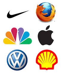
And then there are logos that consist of a logomark (symbol only).
Recognize any of these? Take a guess!
Answers, from left to right:
- Nike
- Mozilla
- NBC
- Apple
- Volkswagen
- Shell
Logo Design Best Practices
There are no hard and fast rules to Logo Design, but there are certainly best practices to be followed.
Here are just a few:
- Design your logo so that it can be adapted to fit within different sized boundaries. This occurs frequently when an Online Business Listing or Social Media Network specifies the precise logo image dimensions (ex: “Profile Picture” for Facebook business pages should be 180px wide by 180px tall).3
- Try not to use more than two colors. For print, multiple colors can mean much higher costs. Online, a logo that is too “busy” can compete for attention at the wrong time, and at very small sizes are usually indistinguishable.
- Is your “brand” recognizable when you display only your logomark? (meaning you exclude the logotype)
- Does your logo look good in black and white? Why does that matter? People will make copies of your paper invoices using black and white ink. The original document may have included your beautiful, detailed logo in the header. Once copied to black and white, it may look like a smudge.
- Avoid gradients.
- Avoid too much detail. A logo CANNOT tell the entire history of your brand / company.
Did we miss any? Add them in the comments below.
How Much Does A Logo Cost?
We cannot take complete “creative” credit for our “Bizeeo” logo design.
We purchased a stock version of our logo for $29. That was a one-time, royalty-free expense. We then adapted the logo to accommodate our color scheme, font preference, aspect ratio and other considerations.
We have many variations of our logo / logomark (scroll down for examples) so that we can accommodate dark backgrounds, height and width constraints, and for use in print (business cards, letterheads, brochures) and marketing merchandise.
We make no apologies for avoiding “from scratch” Logo Design because it saves you money, development time and in most cases, is a complete waste of your marketing budget (we’re referring to instances where you pay hundreds of dollars for a logo design intended for a small, local business).
We are NOT saying that Logos and Branding are not important!
We’re simply advising you to keep this in perspective.
Logo Variations
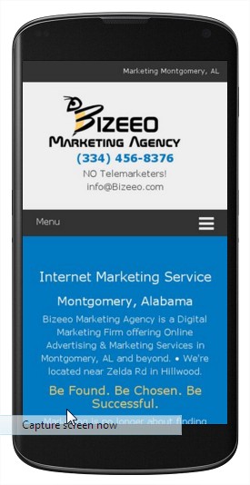
Logo on Smartphone Device
This might be the most important “version” of your logo!
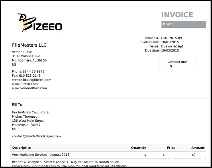
Logo with Partial Logotype
We use this logo variation for letterheads and invoices, both print and digital (see example below).
Logomark Icon
This icon with your logomark can be a clickable hyperlink to another page on your website or any other website.
Try it out, click on it and it will send you to our homepage. Then click the “back” button in your browser to read the rest of this riveting article. 🙂
Black & White Logo
Your logo is going to end up in black and white somewhere, eventually.
And there’s nothing you can do about it.
Get over it.
But be sure you choose a design that properly represents your “brand” when it happens.
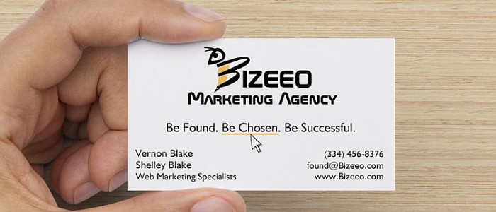
Logo on Business Card
Don’t forget, we provide FREE print Business Cards with your custom logo when you sign up for our monthly marketing plan.
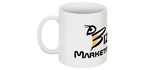
Logomark on Coffee Mug
We can provide coffee mugs, T-shirts and other promotional items.
Logomark Adapted for Darker Background
Logomark with triangular background.
Logomark as Image Watermark
Logomark on triangular background with partial transparency.
Logo Favicon
<—– Right here!
Yep, you need one of these, too!
It’s tiny, but important and effective. Image size is 16px by 16px. See how it’s used below.
Logomark as Favicon
Note the red arrow. Favicon dimensions are 16px by 16px.
You will see favicons on smartphone browsers as well. They also serve as graphic bookmarks on your touch screen.
When Your Brand Goes Viral
We’re not there yet. But we’re working on it! 🙂
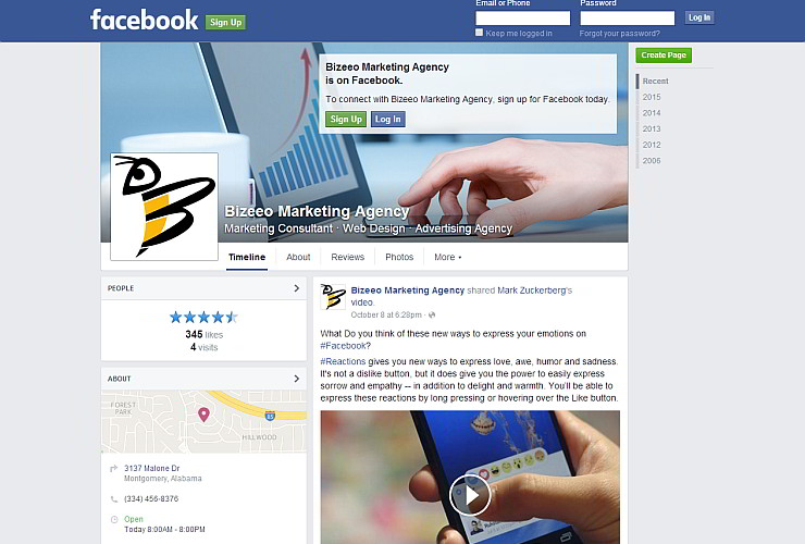
Facebook Profile Image
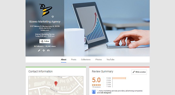
Google+ Business Listing Profile Image
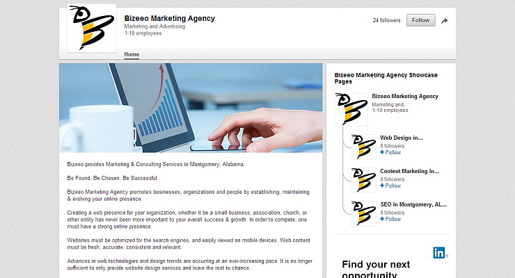
LinkedIn Profile Image
Please Note: Bizeeo™ takes a pragmatic view when it comes to branding issues such as Logo Design. Our Logo Design service is not suitable for everyone. We will be happy to refer you to a graphic designer if needed, or employ their services on your behalf to complement our other marketing services.


